

Cookies Notice
This site uses cookies to deliver services and to analyze traffic.
📣 Introducing AI Threat Modeling: Preventing Risks Before Code Exists

Unified risk and vulnerability management across application, infrastructure, and code quality scanners, with code-to-runtime actionable context
Automated security controls validation and assurance based on your organization’s SDLC policies, with actionable context from your CMDB

Risk Graph policy engine and developer’s guardrails at every phase: design, development (pull request), and delivery (build/deploy)


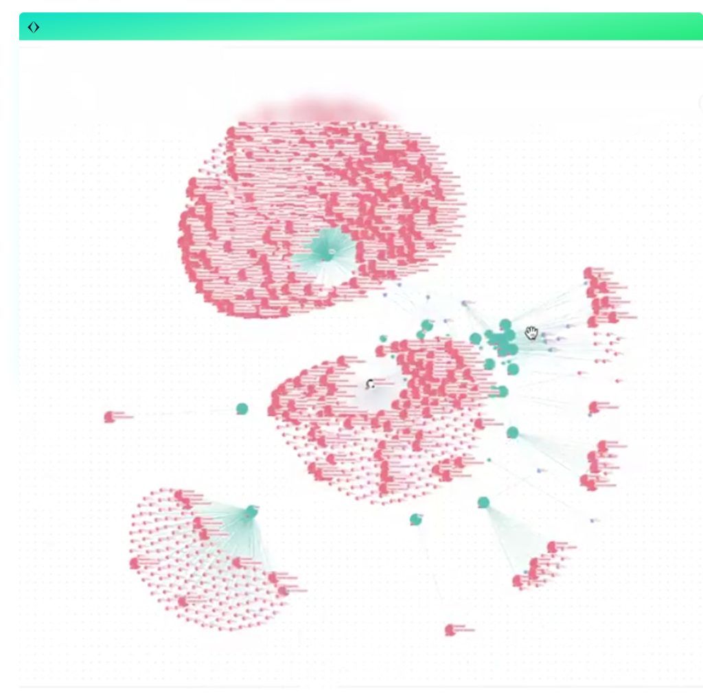
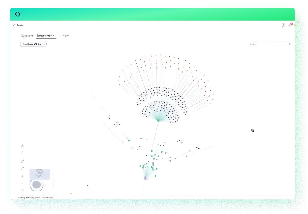
Modern applications are incredibly complex and ever-changing. Code is spread across many repositories, frameworks, and cloud services, making it difficult for security teams to get a clear, up-to-date picture of how everything fits together. Traditional threat modeling often relies on static diagrams or developer interviews that become outdated almost immediately. Apiiro’s Software Graph Visualization tackles this challenge by providing an interactive, real-time map of your entire software architecture enriched with risk insights and context. This post dives into how the Software Graph works, explaining its architecture and unique capabilities, and shows why continuous, accurate threat modeling is finally achievable.

At its core, Software Graph Visualization is powered by Deep Code Analysis (DCA) and code-to-runtime context, the same underlying intelligence used to build Apiiro’s XBOM. The graph represents entities and relationships detected in your codebase, as well as runtime context. This includes:
Entities appear in the graph as nodes, with directional edges that reflect real relationships like which module contains which API, which component uses which secret, or how sensitive data relates to generative AI usage.

As code and runtime context update, the graph continuously updates. There’s no “snapshotting” or manual syncing required. See the demo.
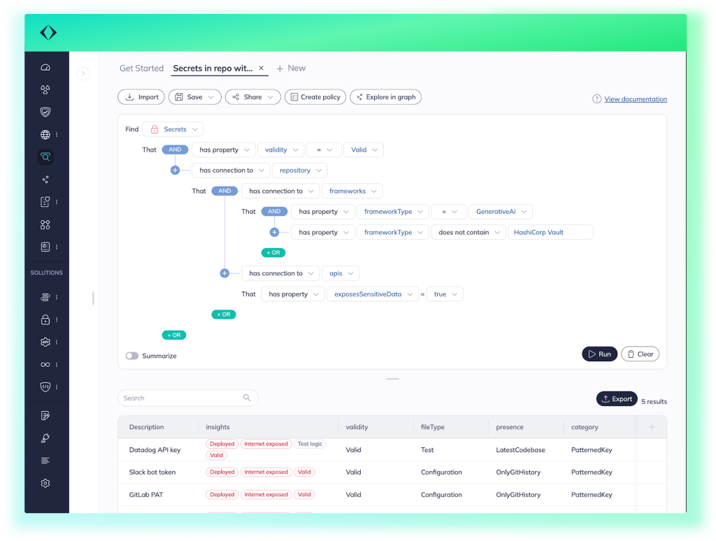
Designed to reflect common security review workflows, the Software Graph comes ready with a set of predefined built-in questions. Each question presents a tailored graph view that focuses on relevant node types, edges, and properties, reducing noise and making the graph easier to interpret and act on.

This improves both usability and signal-to-noise ratio.
Predefined built-in questions include:
These views can be further refined or saved as custom questions for repeated use. See it in action.
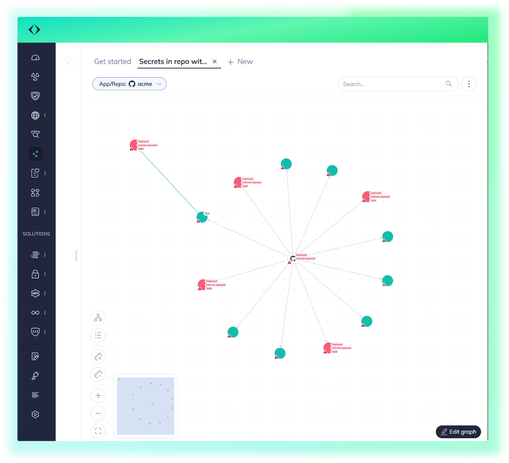
Security teams have fine-grained control over what the graph displays and how it’s visualized. Nodes can be filtered to show only entities that match specific properties, for example, internet-exposed APIs with critical risk scores. Nodes can be grouped based on shared attributes like HTTP method or topology. Node size can be adjusted dynamically to reflect the number of connections or the risk level of a component, helping high-impact elements stand out. Visual badges can be toggled to overlay key metadata such as risk score, programming language, deployment status, or the presence of PII.
The graph also supports interactive exploration: users can hover to preview details, click to expand metadata panes, or right-click to perform actions like locking a node’s neighbors or finding the path between two components.

Every entity in the graph is tied to Apiiro’s broader risk analysis engine. The risk level of each node can be used to influence display (e.g. size by risk severity), allowing teams to visually prioritize what matters. This bridges the gap between structural visibility and actual security decision-making.
With the rapid proliferation of GenAI, it’s crucial to assess the security implications of how these new frameworks are integrated into applications. When a GenAI client is present, the Software Graph can surface the code module making the call, the exposed APIs connected to that module, and whether sensitive data, such as PII, could reach the external service. This enables security teams to quickly answer questions like “Are we sending PII to an external GenAI model?” or “Which module needs a data handling review?” without switching tools or manually tracing the flow.
The graph is fully connected to the rest of the Apiiro platform. Teams can pivot between table-based views in Explorer and visual views in Graph, using the same filtering logic and query language.
Exploratory workflows like:
…can all be run in Explorer, then visualized instantly using the Graph button. Filters and configurations are preserved across views.
For collaboration and audit use, teams can save questions (graphs with full configuration), share via link (graph state is preserved), export to GraphML (for external graph tools or documentation), and export to PDF (including visual legend and metadata).
Apiiro’s Software Graph Visualization is a dynamic, continuously updated representation of how your software is architected and how that architecture intersects with security, risk, and data flow.
It’s tightly scoped, highly configurable, and purpose-built to support modern AppSec workflows.
If you’re already using Apiiro’s platform, this feature is available today for preview. If not, and you’re tired of reviewing security risks without understanding the structure they live in, this is worth a look.

This site uses cookies to deliver services and to analyze traffic.