

Cookies Notice
This site uses cookies to deliver services and to analyze traffic.
📣 Guardian Agent: Guard AI-generated code

Unified risk and vulnerability management across application, infrastructure, and code quality scanners, with code-to-runtime actionable context
Automated security controls validation and assurance based on your organization’s SDLC policies, with actionable context from your CMDB

Risk Graph policy engine and developer’s guardrails at every phase: design, development (pull request), and delivery (build/deploy)


In fast-moving, agile development environments, software architecture evolves constantly. Lacking a reliable way to visualize how components are connected, security reviews risk being slow, shallow, or based on outdated assumptions, and vulnerability management becomes reactive.

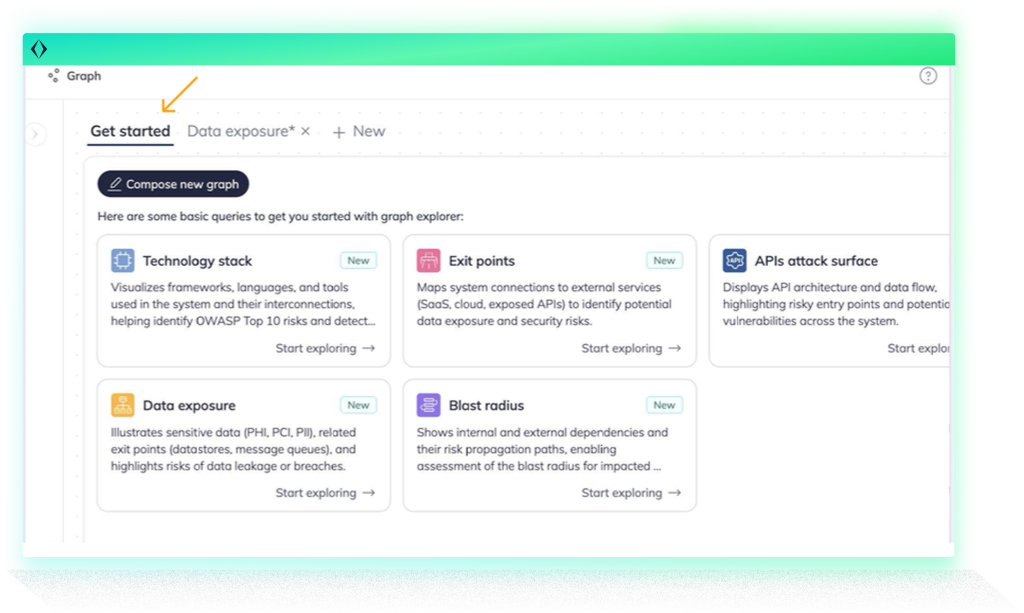
Apiiro’s new Software Graph Visualization gives security teams a real-time, visual map of how software components interact across your systems from code to runtime. Automatically generated from deep code analysis (DCA) and runtime context, the graph helps answer architecture-driven security questions in seconds instead of the usual hours of digging through docs or consulting with developers.
With Apiiro’s Software Graph, you can:
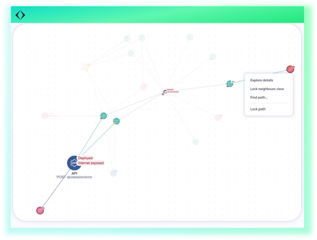
The graph is fully interactive and customizable: highlight sensitive flows, group by technology, scale nodes by risk, or isolate a component’s direct connections to simplify investigations. It’s fully integrated into Apiiro’s broader platform, helping teams move from visibility to action.
Threat modeling often breaks down because teams don’t have accurate, up-to-date architecture diagrams (or worse, rely on assumptions). With Software Graph, you can map applications, APIs, endpoints, and data flows as they exist now, not as they were last documented. Visualize cross-boundary data movement, ungoverned exit points. Move threat modeling earlier in the lifecycle, and keep delivery moving fast.
Scoping penetration tests without clear architectural context is checkbox security that leads to blind spots. The graph makes it easy to spot internet-facing components, sensitive data paths, embedded secrets, or vulnerable open-source packages, all in one view. Security teams can define more targeted scopes and communicate risk more clearly to testing partners.
New code often brings new risk, but pinpointing what changed and why it matters is challenging. Software Graph lets teams compare pre- and post-change states to see how new endpoints, dependencies, or exit points reshape the system. Use this view to drive contextual security reviews and reduce back-and-forth between AppSec and engineering.
Tracking the movement of sensitive data is essential for privacy, especially as systems grow more complex. Visualize where PII, PHI, or PCI data resides in code, how it flows through services, and whether it’s connected to third parties or GenAI frameworks. Understand if encryption, authentication, or other controls are in place, at a glance.
When a vulnerability is found, the graph shows its potential impact. Trace which modules, services, and data flows depend on the affected component, so you can triage incidents based on real architectural dependencies, not just theoretical exposure.
Generic scoring and alert fatigue make it hard to focus. Apiiro brings code-to-runtime context into vulnerability management, showing which risks are actually deployed, exposed, or handling sensitive data. The graph helps you route issues to the right team and prioritize remediation that truly reduces risk.
What sets Apiiro apart isn’t just that you can visualize your software architecture. It’s that every node, path, and connection in the graph is continuously analyzed for risk. Sensitive data exposure, code changes, vulnerable dependencies, exposed APIs, and unguarded entry points are automatically surfaced, then visually highlighted based on real architectural context.
The graph reflects Apiiro’s deep understanding of how risk propagates through software. Critical issues aren’t buried in static lists; they’re made visible where they live: in your system’s structure. And because Apiiro maps ownership across modules and teams, risk is always actionable.
Unlike other tools that throw raw data into a generic graph, Apiiro’s Software Graph is built around real questions. It’s designed to help security and engineering teams align on architecture and risk, whether you’re preparing for a compliance audit, investigating an incident, or reviewing a proposed change.
Because it’s built on Apiiro’s deep code analysis and runtime matching, the graph continuously updates as your software evolves. It’s visual, queryable, and backed by rich context that helps teams move faster with less guesswork.

This site uses cookies to deliver services and to analyze traffic.